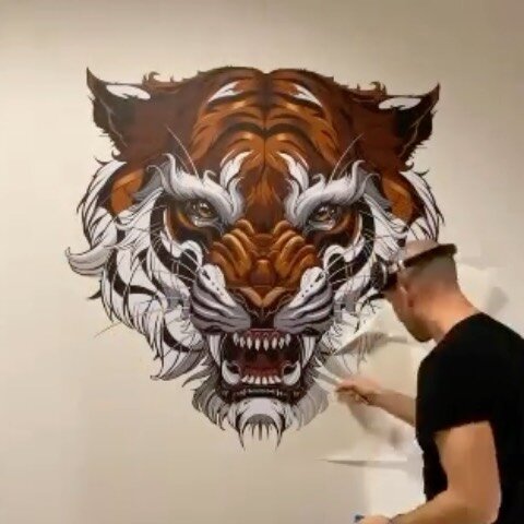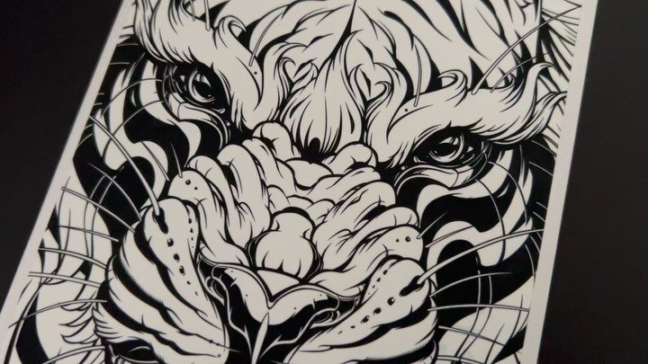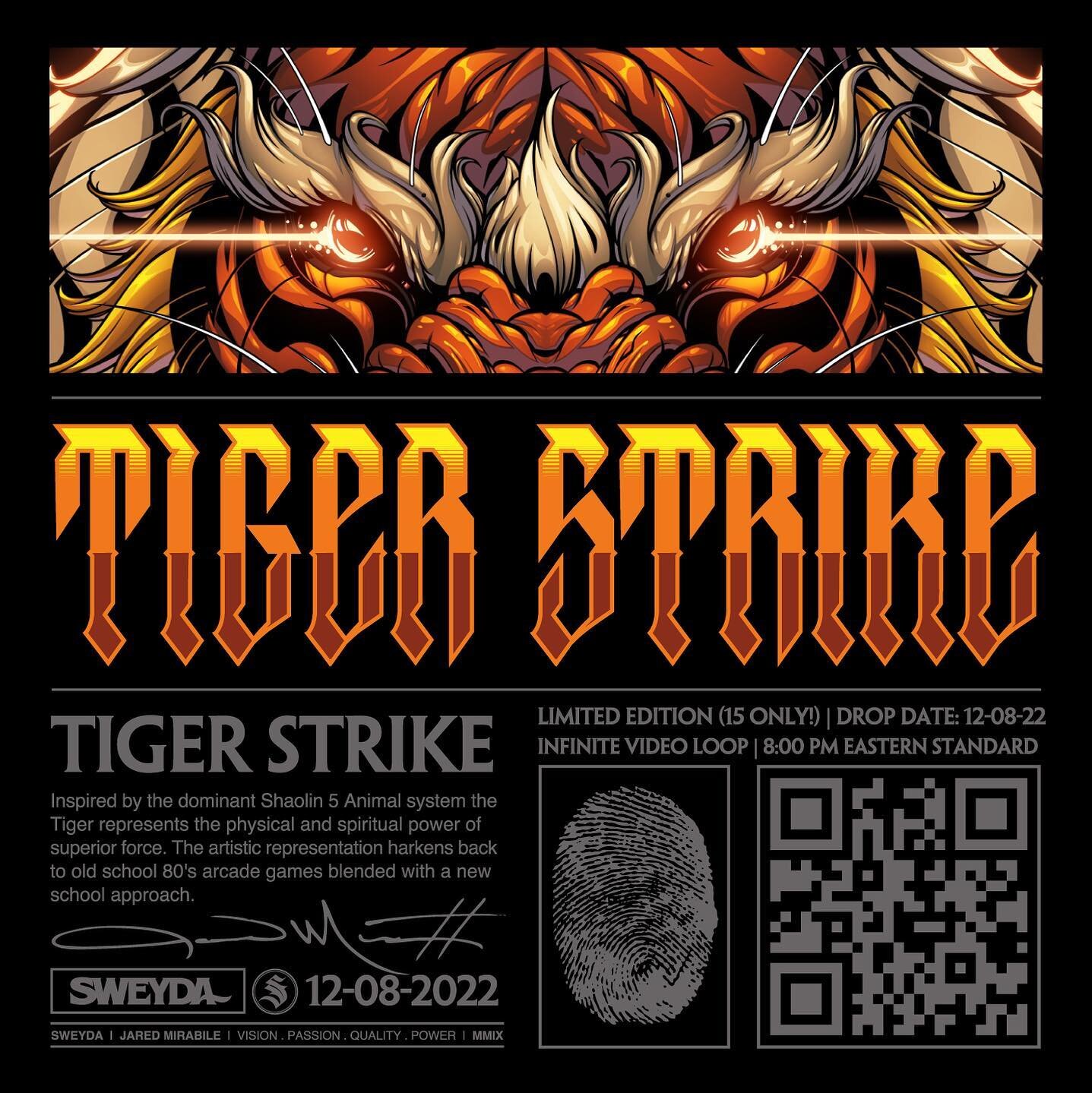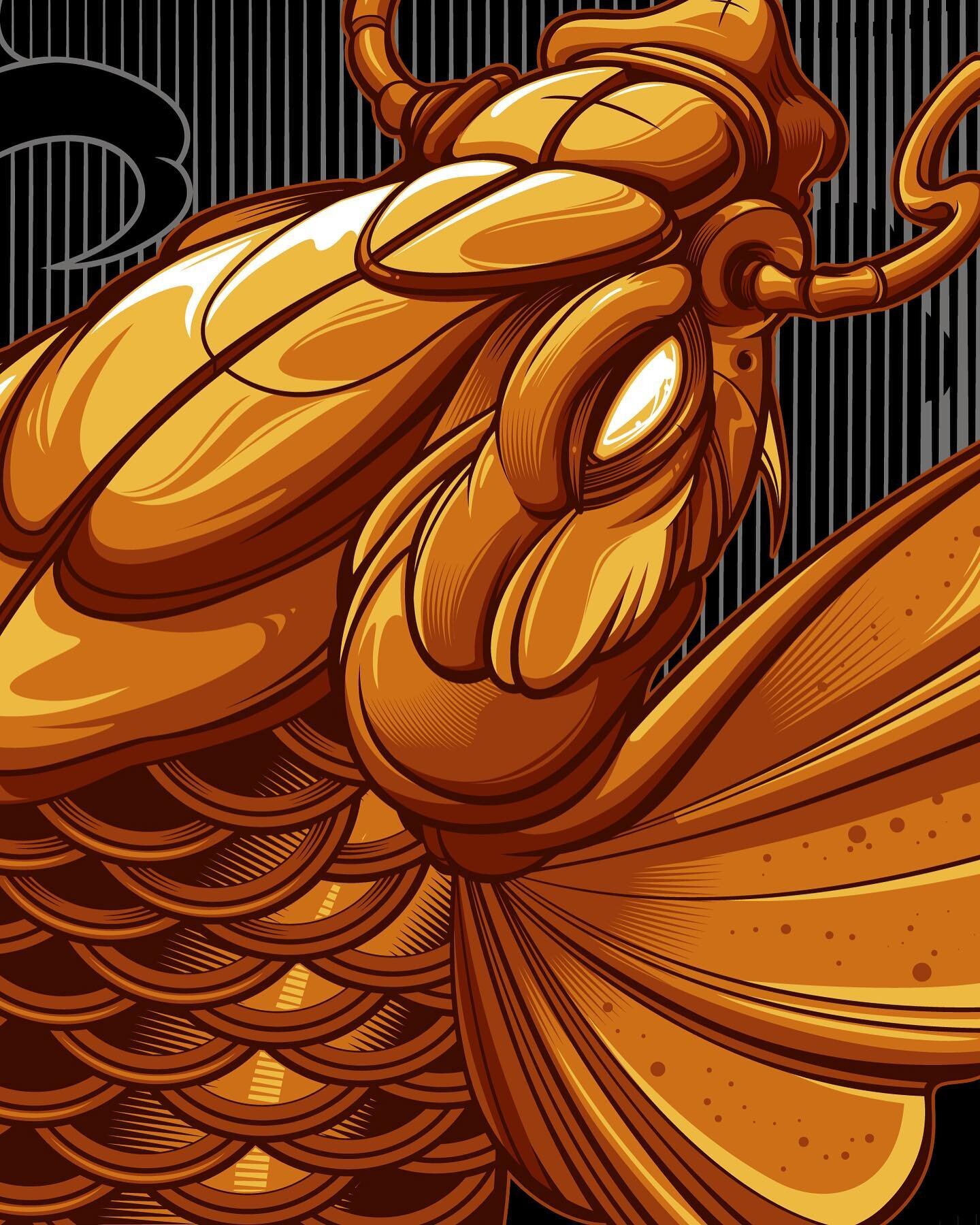
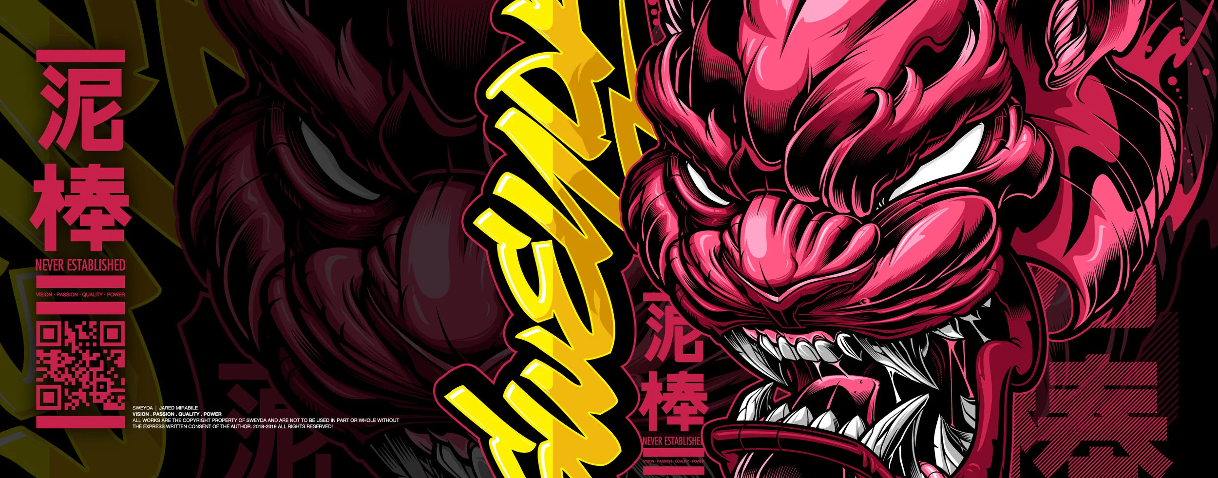


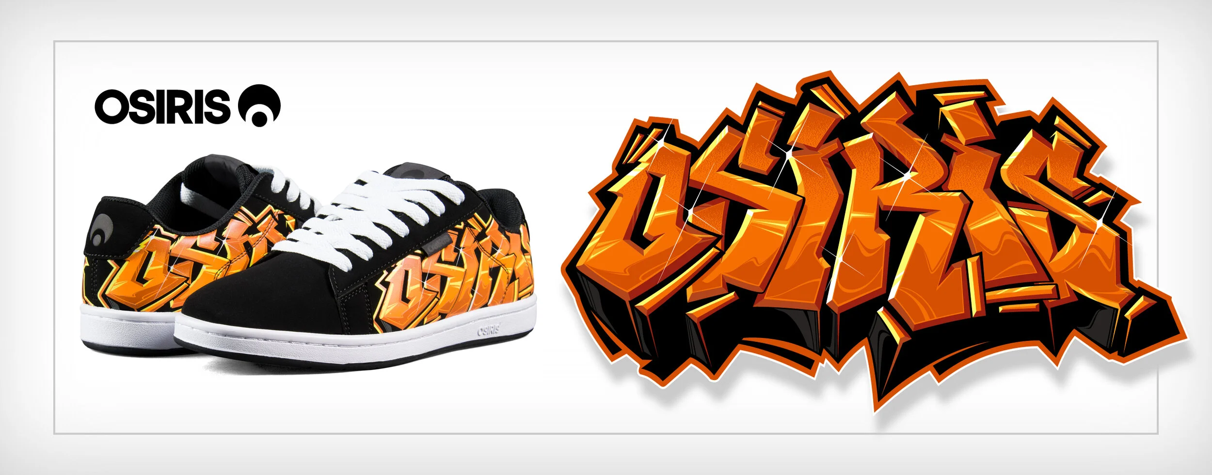


illustrations
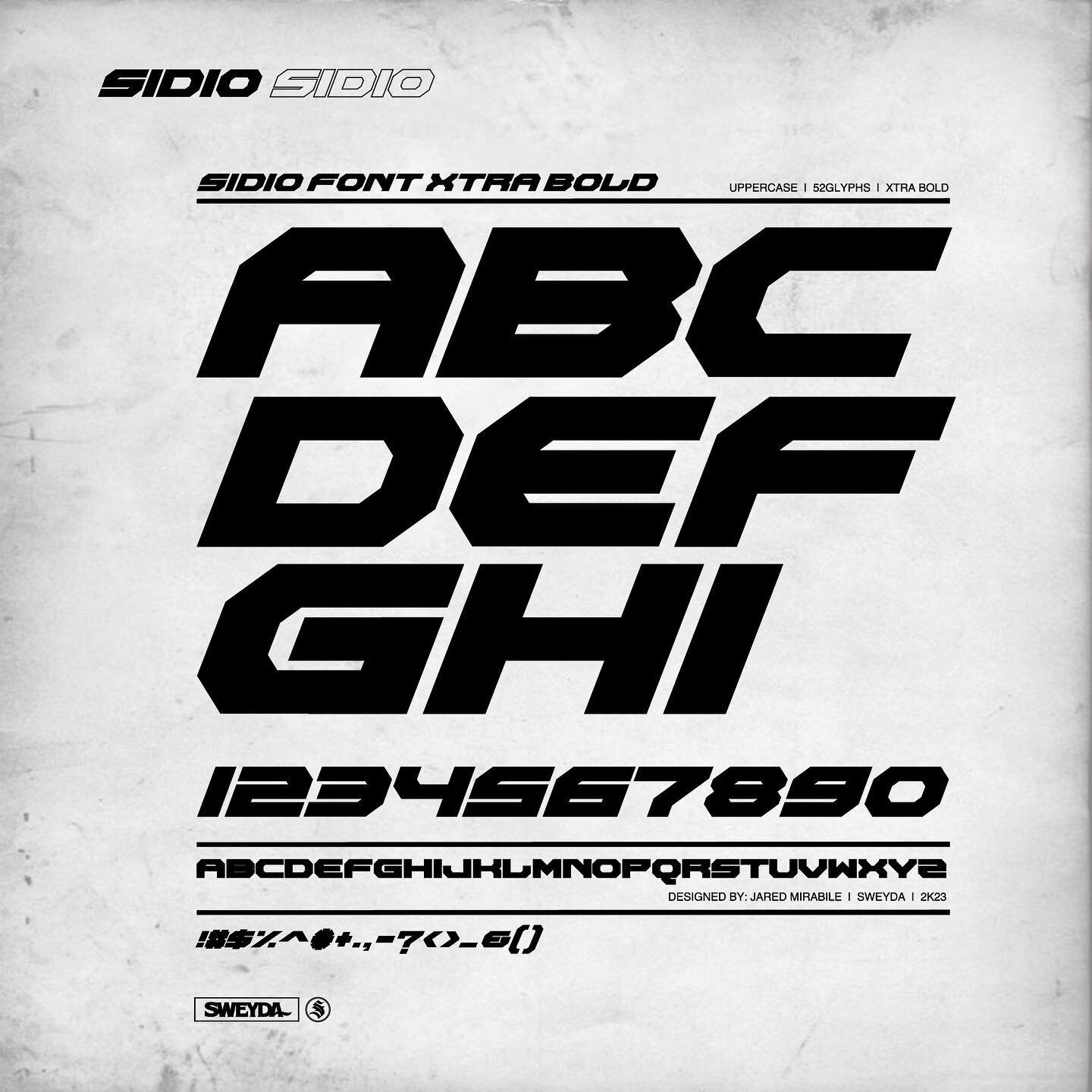
typography
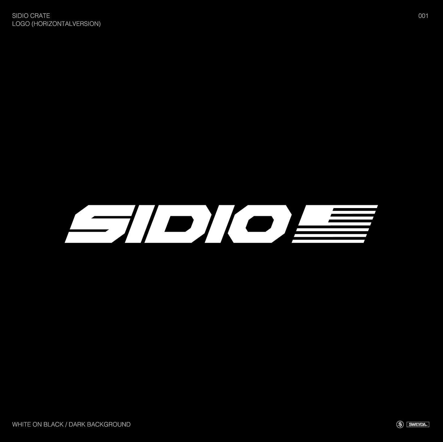
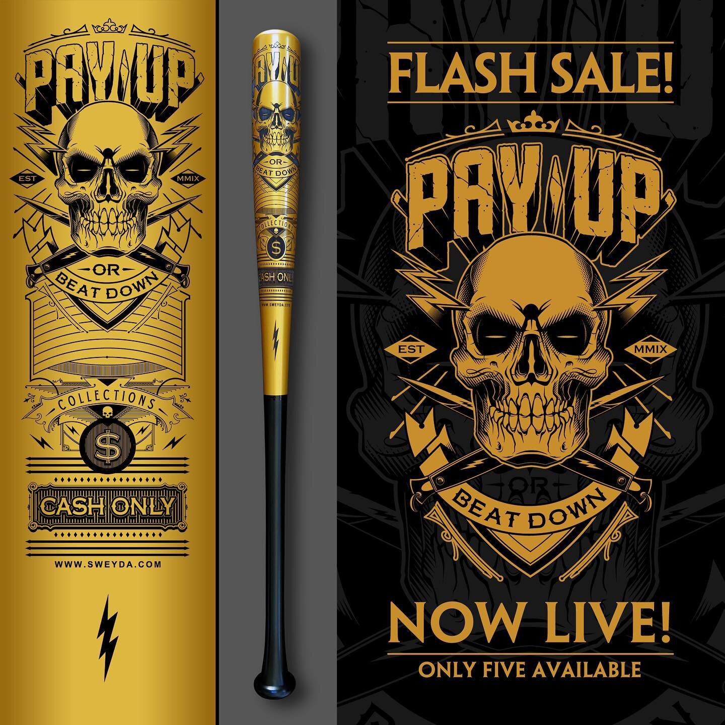
Logo design
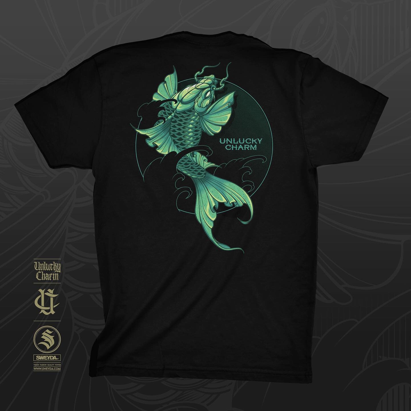
shop

illustrations

typography
Logo design

shop


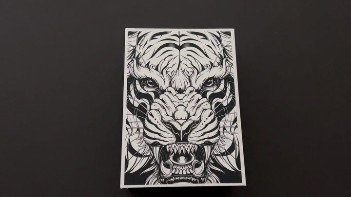
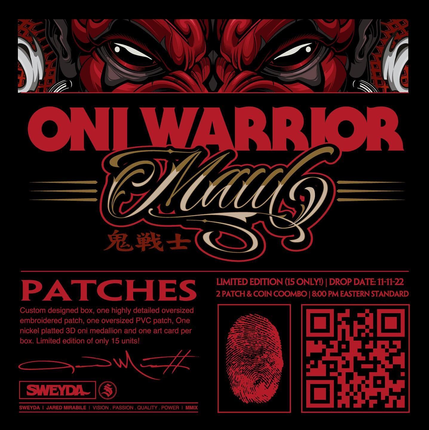
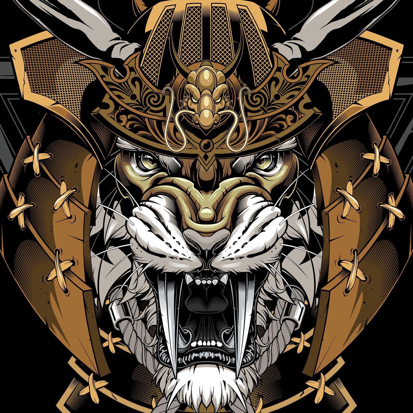
With roots deep in traditional illustration, each piece conveys an authentic and genuine quality of being hand crafted. Each piece is labored over to not only reflect the clients uniqueness and brand individuality, but to capture and communicate a stylistic tone that separates it from the competition and rises above the market noise.
The works, products and other creations all reinforce a guiding principal of being focused on quality & diversity over quantity.
Sweyda is creatively growth minded, stylistically ever evolving and not just an expert but an innovator in its practicing fields.
Disciplines: Typography (hand lettering), Merchandise Development, & Custom Illustrations.